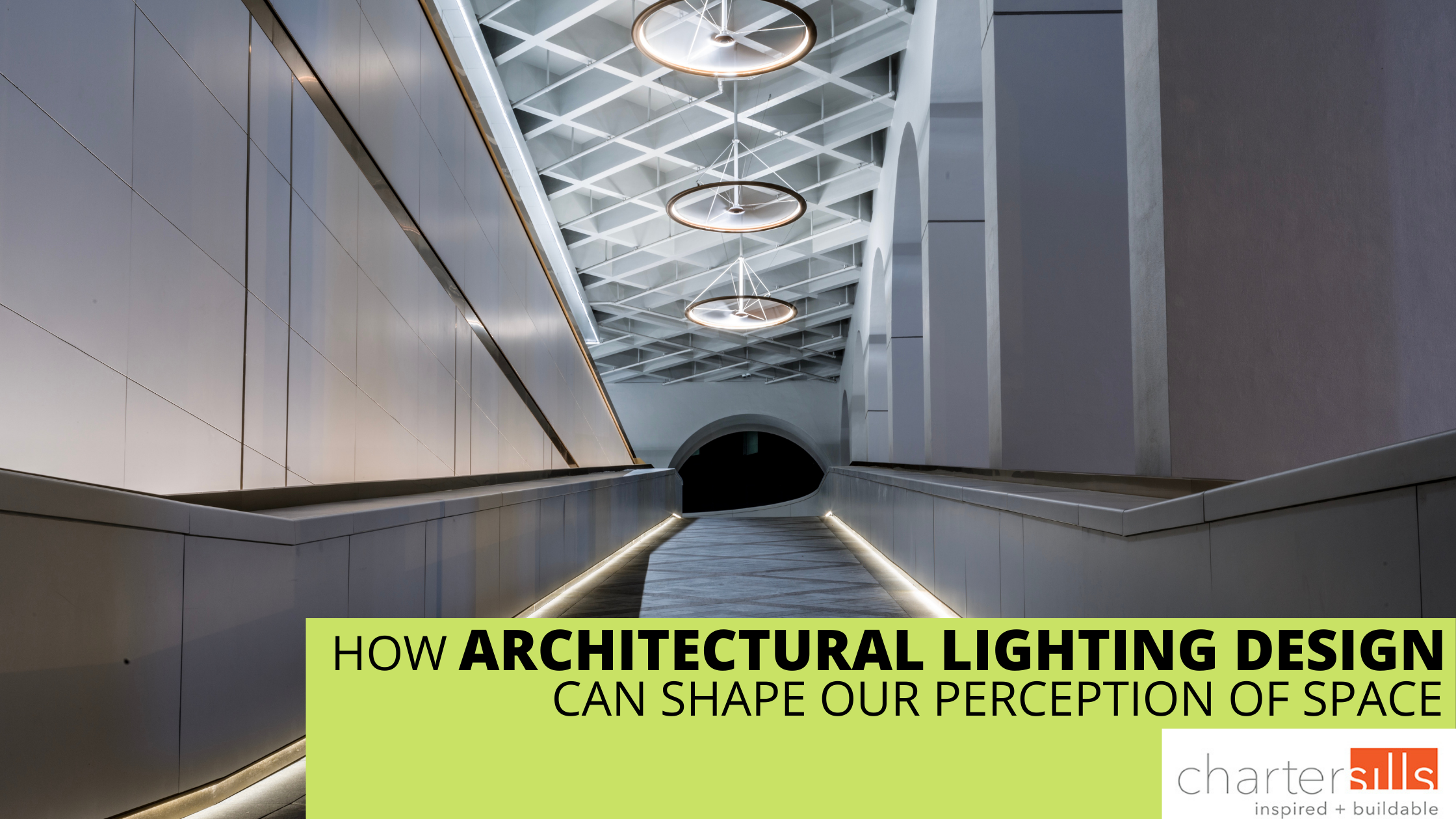
Stripped down to the most basic description, architectural lighting design is a process of incorporating illumination into an architectural design, whether that be a new construction or a restoration. At its core, however, architectural lighting design fulfills a much more important role than simply lighting up a building: illumination is an integral part of realizing the architect’s vision and articulating the intended character of a given space.
In previous blogs, we have explored some of the ways that effective lighting can set the mood of a room, make it easy for visitors to navigate the space, and create a comfortable atmosphere that helps boost productivity. Illumination plays a critical role in highlighting key architectural features, but its role goes beyond simply drawing our attention to decorative elements or artwork. When lighting is properly tailored to a space, it can impact our perception of height, depth, and overall spaciousness. In this month’s blog, we look at how a few key lighting techniques shape what we see.
High ceilings…even if they aren’t
When it comes to lobbies, offices, and other public spaces, high ceilings are often all the rage. Sometimes that height is an integral part of the construction, but in other cases, soaring ceilings are simply not in the cards. Clever lighting design, however, can make the eye perceive more height, helping interiors feel more spacious or exteriors feel more striking.
As we saw in our April blog on hotels, lighting plays an important role in how we perceive the actual layout and size of a space. An abundance of light can help a room feel larger than it is, keeping a relatively compact space from feeling cramped. Harnessing or approximating natural light can help make a room feel more spacious.
In order to make a space feel taller, lighting needs to draw attention towards the ceiling to some degree. When the space above our heads is full of light, it feels more spacious. Shadows in corners or along the walls can create what is known as the cavern effect, which gives a more closed-in feel to a space. When ambient lighting also illuminates the walls and ceiling, however, the room feels taller. Diffuse uplighting adds more uniform ceiling luminance. A light-colored ceiling will then serve as a reflective surface, bouncing that light back to create a low-contrast space that feels loftier.
Uplighting can also be combined with wallwashing, which applies light evenly onto a vertical surface by placing the luminaire at least 12 inches from the wall plane. Wallwashing adds soft, gentle ambient lighting that smooths over the texture of the surface, creating a more spacious feel for a hallway or a room.
Creating an illusion of high ceilings can also impact our spatial perception in other ways. Strategic patches of light that draw the eye up and make the ceiling feel taller, can at the same time make a hallway feel shorter. This can be particularly helpful in hotels, so that the walk from an elevator to a guest room might not feel quite so long for a weary traveler.
Uplighting is not just all about ceilings, however. When used on exteriors, it can dramatically impact our perception of height as well. In our design for the Chervon Group Headquarters in Nanjing, China we used uplighting on the floating roof to draw the eye up and make the building feel taller.
Creating a cozy feel
Not every space necessarily needs to feel open and spacious, however. When faced with high ceilings but aiming for a cozier, more intimate atmosphere, once again lighting can save the day. If a restaurant, hotel, or residence is aiming for a homier feeling, high ceilings might take away from the intended character of the space. Opting for “warmer” light (less than 3000 Kelvin) can help create a sense of coziness that encourages guests to settle in and linger.
Dividing a space vertically by the rule of thirds gives the lighting designer a sense of where to direct light, and where to create shadows, in order to make a room feel smaller and more cohesive. Each third of the room serves as a layer, with lighting tailored to achieve the desired effect. Lower hanging pendants over tables or seating areas can help create focal points with more focused downlighting. These areas of high contrast create a sense of little islands within a larger space.
Using lighting to create these separate gathering spaces also makes a space more flexible throughout the day. A hotel lobby that wants to keep guests moving in the morning and afternoon but switch over into a more relaxing hangout space in the evening can create these smaller spaces simply by flipping a few switches in a few key areas. Suddenly, parts of the space that felt lofty and spacious become snug and inviting. Lighting gives us ways to make an entire space—or just part of a space—feel smaller and cozier without adding excessive furniture, plants, or other items that can make it feel cluttered.
These different techniques all illustrate the importance of integrating lighting design into the overall architectural design process. Lighting considerations can help shape final construction needs and provide a variety of options that will bring the client’s vision to life.
At CharterSills, we believe that when lighting is designed correctly, it can add dimension to the simplest of spaces. Lighting can turn an ordinary space into a work of art. Whatever design challenges clients present, CharterSills responds with a solution that exceeds their expectations. Contact us today at (312) 759-5909 or by email at info@chartersills.com.


